Summary:
What Interior Painting Colors Are Trending in Nassau County for 2025
This year’s interior painting trends are all about moving away from the stark whites and cool grays that dominated the past decade. Instead, homeowners across Nassau County—from Hempstead to Great Neck—are embracing warmer, more personal colors that create genuine comfort.
The biggest shift? Colors with emotional depth. Think rich earth tones, soft sage greens, and even bold jewel tones that add personality without overwhelming your space. These aren’t just pretty house painting choices—they’re strategic decisions that help your home feel more like you.
What’s driving this change among Nassau County homeowners is simple: people want their homes to feel like sanctuaries. After spending more time indoors, families are realizing that interior painting isn’t just decoration—it’s daily mood therapy.
Calming Neutrals That Actually Have Personality
Forget beige. The neutrals trending in 2025 interior painting have character and warmth that make rooms feel instantly more sophisticated.
Cinnamon Slate leads the pack as Benjamin Moore’s Color of the Year. It’s a sophisticated blend of heathered plum and velvety brown that works beautifully in Nassau County’s mix of traditional colonials and contemporary builds. Complex enough to feel interesting, neutral enough to live with long-term.
Quietude brings soft sage with whisper-blue undertones. This interior painting choice works particularly well in Nassau County homes with abundant natural light—think those beautiful Roslyn Heights properties with southern exposure—where it shifts from calming green to soothing blue throughout the day.
For something lighter, consider Mocha Mousse, Pantone’s color of the year. This warming brown creates that perfect coffee shop vibe, inviting spaces that make you want to linger. It pairs beautifully with the white trim common in Nassau County’s older homes, from Freeport Victorians to Mineola Cape Cods.
These aren’t your builder-grade beiges. They’re interior painting colors with enough complexity to feel custom and personal, but enough restraint to work with your existing furnishings and architectural details.
The key with these trending neutrals? Understanding their undertones. Cinnamon Slate leans purple in north-facing rooms but shows its brown warmth with southern exposure. Test your interior painting picks in different lighting conditions—Nassau County’s varied home orientations mean the same color can look completely different from house to house.
Bold Interior Painting Colors That Work in Traditional Nassau County Homes
Think your 1950s Levittown ranch or turn-of-the-century Oyster Bay home can’t handle bold interior painting? Think again. The right saturated shades actually highlight your home’s architectural character rather than fight against it.
Deep blues are having a major moment in Nassau County interior painting projects. Colors like navy or rich mid-tone blues add sophistication to dining rooms and home offices. These blues feel classic enough for older homes but fresh enough to feel current—perfect for those beautiful Port Washington colonials or Garden City Tudors.
Rich greens work beautifully too, especially in Nassau County homes with good natural light. Sophisticated hunter greens with gray undertones create stunning powder rooms or accent walls in living spaces. They’re particularly gorgeous in those sun-filled Manhasset kitchens or Westbury family rooms.
Don’t overlook deep purples and plums for your interior painting project. These colors might sound intimidating, but they create incredibly cozy, sophisticated spaces. They work especially well in bedrooms and lounges where you want that wrapped-in-luxury feeling—think those spacious master suites common in Hewlett Harbor homes.
The secret to making bold interior painting colors work in traditional Nassau County homes? Balance. Use them strategically—maybe one accent wall, or in rooms where you spend shorter amounts of time. Pair them with crisp white trim to let your home’s architectural details shine.
Bold doesn’t mean overwhelming. These interior painting choices create focal points that draw the eye and make spaces feel intentionally designed rather than just painted. In Nassau County’s competitive housing market, that kind of thoughtful detail makes a real difference in both daily enjoyment and home value.
How to Choose Interior Painting Colors for Different Nassau County Rooms
Not every interior painting color works in every space, and that’s especially true in Nassau County homes where room sizes, natural light, and architectural details vary dramatically from house to house.
Your house painting choices should work with each room’s function, lighting, and size. A color that creates perfect serenity in your bedroom might feel too subdued in your kitchen. Understanding these relationships helps you create cohesive interior painting throughout your home.
The goal isn’t matching everything perfectly—it’s creating a sense of intentional progression from room to room that feels natural and comfortable.
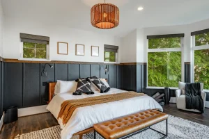
Living Room Interior Painting That Creates the Right Atmosphere
Your living room sets the tone for your entire Nassau County home, so this is where you want interior painting colors that feel welcoming but not overwhelming.
Warm neutrals work beautifully here because they create a backdrop that lets your furniture and artwork shine. Colors like the trending Cinnamon Slate or softer options like mushroom grays give you sophistication without competing with your décor—perfect for those open-concept homes popular in newer Nassau County developments.
If your home has a more open floor plan, consider how your living room interior painting flows into adjacent spaces. You want harmony, not jarring transitions. Soft, complex neutrals bridge different areas naturally, creating that seamless flow that makes homes feel larger and more expensive.
For Nassau County homes with traditional separated rooms—common in older Rockville Centre or East Meadow neighborhoods—you have more flexibility to go bolder. Deep blues or rich greens can create stunning focal points, especially if you have good natural light or interesting architectural details to highlight.
Consider your furniture when choosing living room interior painting colors. Dark colors make light furniture pop, while lighter walls help dark pieces feel less heavy. If you’re planning to update furniture soon, choose your house painting colors first—it’s much easier to find a sofa to match your perfect wall color than vice versa.
Lighting matters enormously in living rooms since you use these spaces from morning through evening. Test your interior painting choices at different times of day to make sure they feel right with both natural and artificial light. Many Nassau County homes get beautiful morning or evening light that can completely change how colors appear throughout the day.
Bedroom and Kitchen Interior Painting Strategies That Actually Work
Bedrooms and kitchens have completely different interior painting needs, but both require thoughtful planning to get right.
For bedroom interior painting, you want colors that promote rest and relaxation. The trending soft sage greens like Quietude work beautifully here, creating that spa-like calm that helps you unwind after busy Nassau County days. Deeper colors can work too—rich plums and deep blues create cozy, cocoon-like spaces perfect for sleep.
Avoid interior painting colors that are too stimulating in bedrooms. Bright yellows and vibrant oranges might feel energizing during the day, but they can interfere with your ability to wind down at night. Save those energizing house painting colors for spaces where you want to feel alert and active.
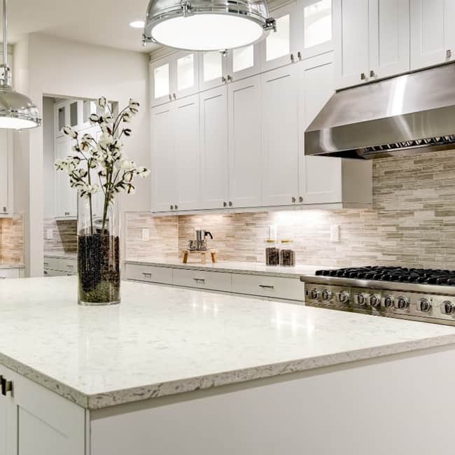
Kitchen interior painting needs colors that feel fresh and clean while working with your cabinetry and countertops. If you have white or light cabinets—common in many updated Nassau County homes—you have flexibility to go darker on walls. Rich blues, deep greens, or even charcoal grays create sophisticated backdrops that make white cabinets pop.
For darker cabinetry, lighter interior painting colors keep the space from feeling cave-like. Soft neutrals with warm undertones work well, or consider very light versions of trending colors—think pale sage instead of deep green, or soft mushroom instead of rich brown.
Kitchen lighting is crucial for interior painting success. Many Nassau County homes have kitchens with limited natural light, which means your paint color needs to work well under artificial lighting. Cool colors can feel stark under warm LED bulbs, while warm colors might look muddy under cool fluorescent lighting.
Test your kitchen interior painting colors with your actual light fixtures before committing. What looks perfect in the paint store might feel completely different in your specific Nassau County home with your specific lighting setup.
Making Your Nassau County Interior Painting Dreams Reality
Choosing the right interior painting colors for your Nassau County home isn’t just about following trends—it’s about creating spaces that reflect your personality while adding real value to your property.
The interior painting colors trending in 2025 offer something for everyone, from calming neutrals that work beautifully in traditional homes to bold statement colors that add personality and sophistication. The key is choosing house painting colors that work with your home’s architecture, lighting, and your family’s lifestyle.
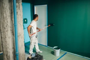
Remember that great color choices are only as good as the application. Working with experienced painting contractors ensures your beautiful interior painting selections get the expert preparation and application they deserve. When you’re ready to transform your Nassau County home with trending colors that will make you smile every day, we at Aura Painting bring the expertise and attention to detail that makes the difference between a paint job and a true transformation.